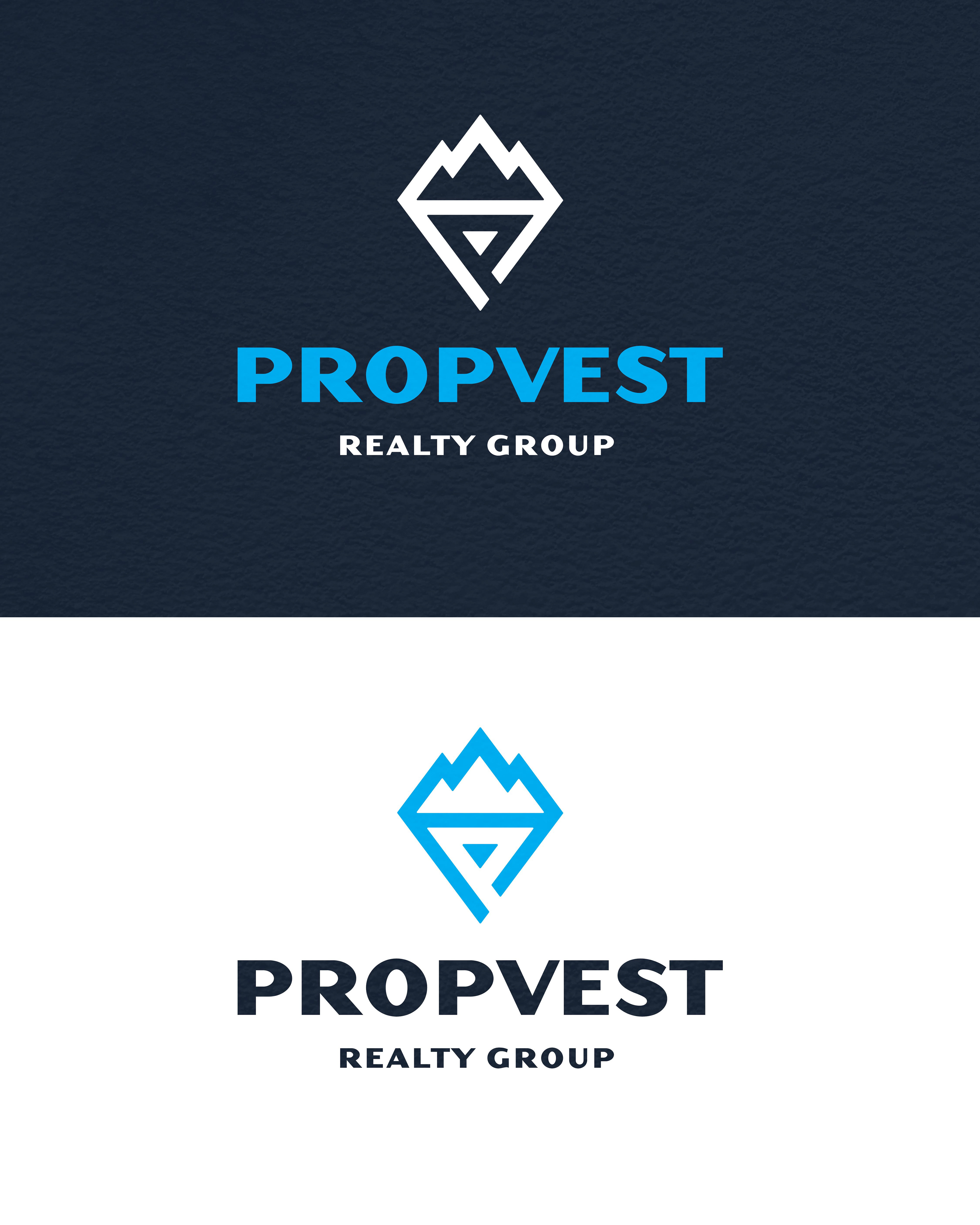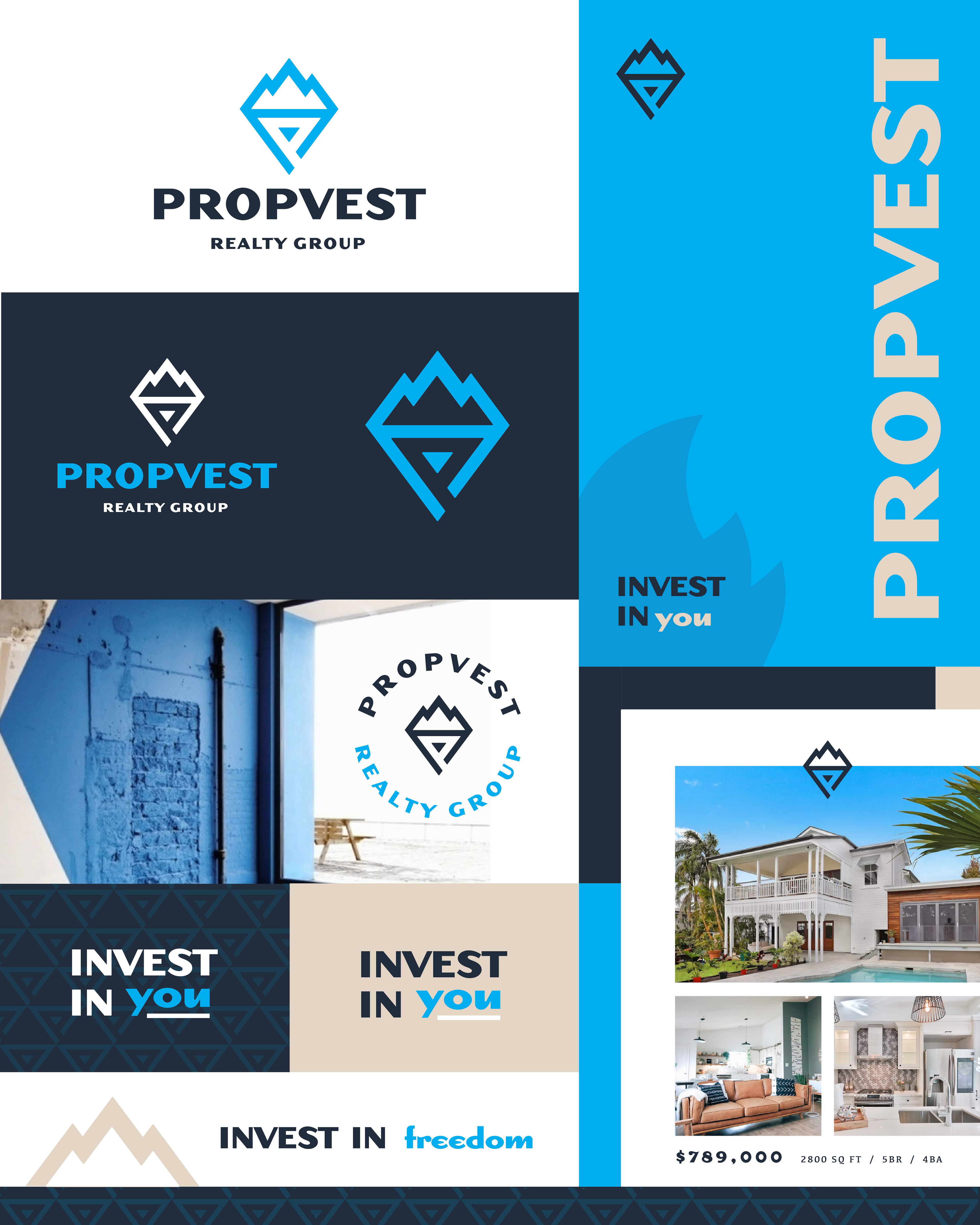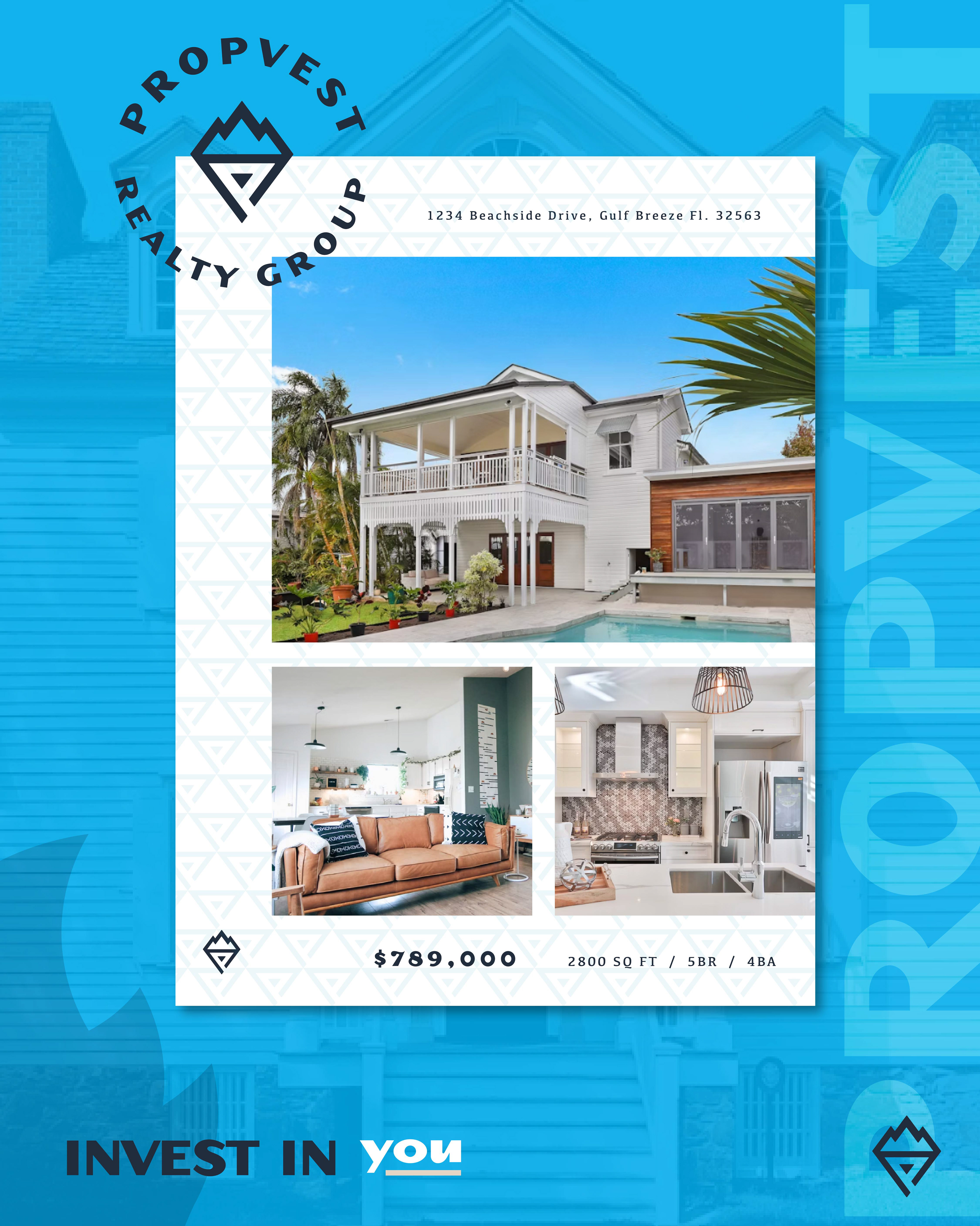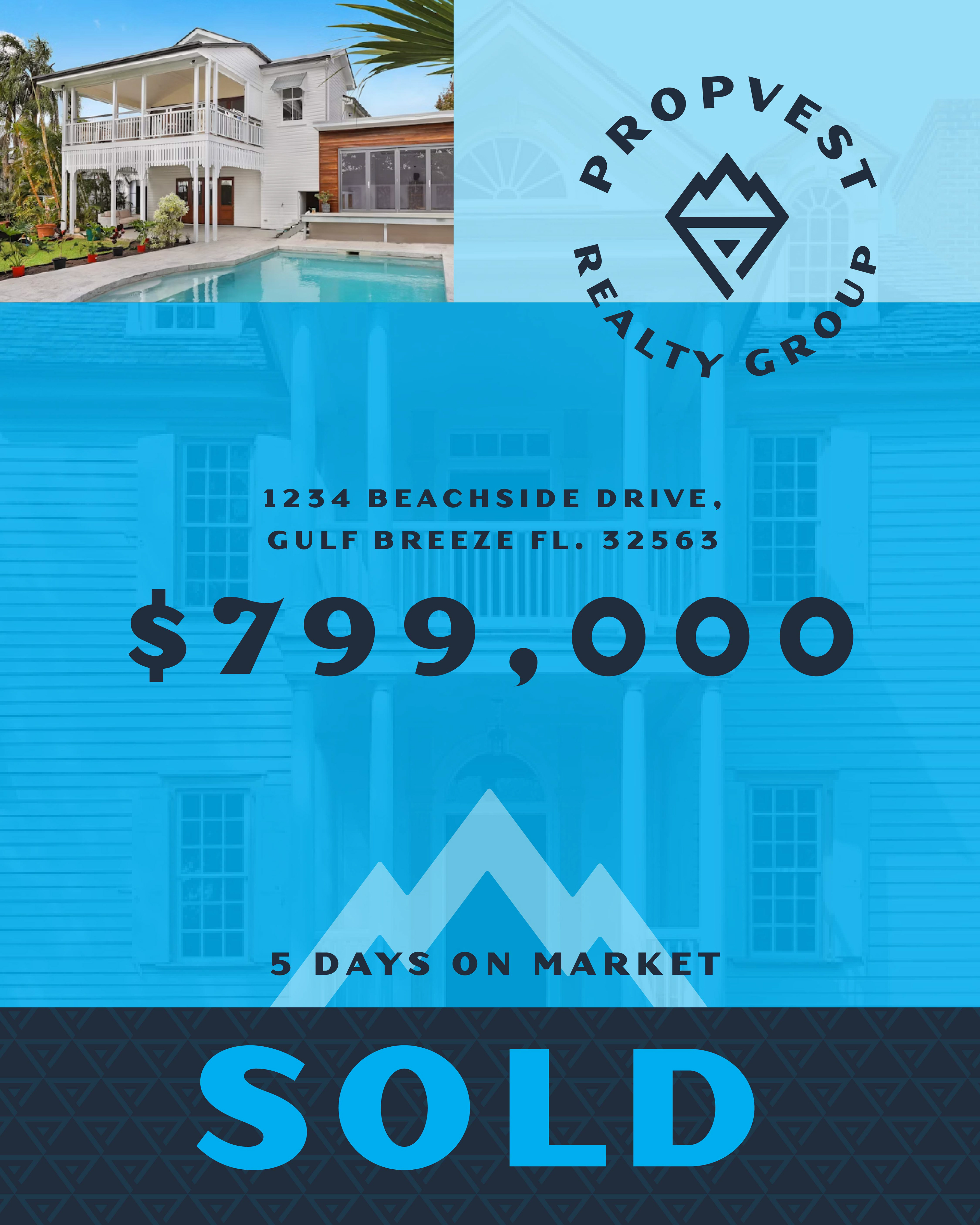
Potential logomark and branding package for a Property Group that wanted to stand out from their competitors as bold and fresh. The client needed to be unique and recognizable right away. By using the letter "P" as the anchor for the logo, we began to build on what makes the client special. By combining the letter P with mountains and a torch symbol, this logo mark signifies stability, growth, life and energy.